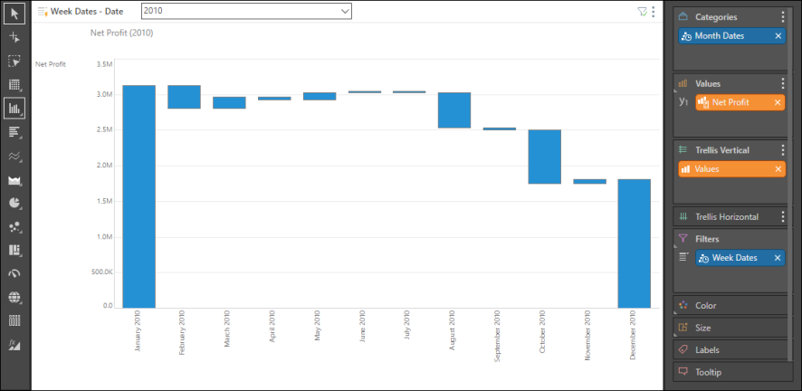
Waterfall charts allow you to display a running total for a given data point as values increase and decrease over time.
Watch these 2 videos on to learn how to build waterfall charts.
Building a Waterfall Chart
Start by adding a time dimension to the query, then add the required measure. In this example, we see Net Profit, month by month, over 2010.

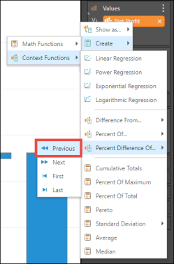
At this point, we can add color logic to the given measure, to make the chart more meaningful. To do this, add a second orange chip representing the given member to, and right click on it. Select the calculation that fits the way you want to visualize the difference between values in the chart. In this example, Percent Difference of Previous is selected.

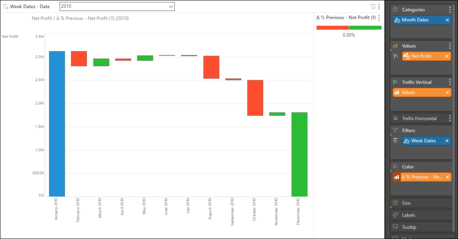
Drag the new custom measure chip to the Color zone and drop it into required color logic sub-zone. In this example, the Positive Negative option was chosen. Accordingly, the chart is color coded so that each bar displays the percentage difference from the previous bar. Increases are shown in green, while decreases are shown in red. Hover over the bars to see the exact percentage difference and value in the tooltip.
